From Light to Dark: The Story Behind Dark Mode on the Android Uber App
5 October 2023 / Global
Introduction
Dark mode was natively supported by the release of Android Q. It has started to become a popular feature since it reduces eye strain in low-light environments, it’s aesthetically pleasing, and battery-efficient in modern hardware. We wanted to bring these benefits to the Android Uber Rider app.
Discussing dark mode with a friend, he was under the impression that dark mode was just a simple theme. While this statement might appear to be true, it left me wondering: “If it is as easy as swapping themes, why haven’t we done it already?” Spoiler: it was much more complicated, since you can’t simply swap a few colors.
The current Android Uber app was released before dark mode existed. The features included in the app were made without having dark mode in mind. This means that color and style resources were hardcoded. On top of that, after dark mode was introduced, we didn’t adopt it right away and kept building new features with this old mindset.
Why not find those colors and replace them? We would need to verify that the replaced colors didn’t make other elements harder to see. Doing this would require manually testing all the affected UI elements. Reaching certain UI elements requires specific criteria to be met. For example, Uber has a service in Brazil called “Moto,” which is not available in the US. Reaching the Moto flow will feature specific knowledge outside of the scope of our team. In other words, our team doesn’t know every possible flow–some of them are specific to certain cities, countries, statuses, features, regulations, etc. If we fail to meet some of them, the app could be unusable.
On the other hand, feature teams know their flows better, but to meet our dark mode support deadline, we needed to provide proper tooling so they could understand how their features would look once dark mode was enabled.
We needed to find a way for new features to be planned with dark mode in mind and migrate the old features as well.
Back to Basics
The Design team has had a vision for dark mode for a long time. However, we have some problems: the app doesn’t support dark mode, and who is going to implement it? Since we require a standardized way of implementing dark mode across the app, Platform teams were an integral part of the migration.
On a foundational level, we needed to think about how we can make dark mode adoption intuitive for the engineers. Since we already have a set of reusable components throughout the app, we can leverage that infrastructure to ramp up the adoption of dark mode and maintain it for the long run.
Some of the UI elements that we relied on were themes, icons, typography, and reusable components.
The themes would help us to have color token attributes that will automatically switch between light and dark, we called these Platform Colors. In this fashion, Android engineers can just call an attribute like?textPrimary in their XML file or resolve the attribute color without thinking about what color to use in dark mode.
For our icons, we decided to set a default color to all the vectors, so they know what to expect when they use them. If they want a different color other than the default, they can simply tint it with a different Platform Color. The same case would apply to Typography.
Lastly, we have a Design System, including a library of components, that we call Base. This Design System supports dark mode out of the box and requires little to no configuration to achieve the desired style.

This library of components helps feature engineers to focus on their business logic and less on the design and behavior of their elements, and on top of that, would help the Uber brand to be reflected on every screen with a consistent user experience.
Tooling and Discoverability
As you can imagine, Uber’s Android repository is quite extensive. This would make new components and color themes hard to discover on their own. For easier discoverability, we leverage an internal app called Style Guide. This is a catalog of components and colors available across the Uber apps. The Style Guide app also allows developers to find the right settings according to their needs by adjusting the components’ configurations, and maybe finding some more capabilities that they weren’t aware of. Engineers can turn on a “Dark mode” setting to see how the components or the colors look.

Developer Dark Mode Plugin
As engineers create their features, they can verify that it supports dark mode before it reaches production. For this, we created a plugin in the Uber app that allows us to easily change between different theme settings (Auto, Light, Dark, System).

Design Specs
Designers are a crucial part of this process, creating the features and colors to be used in the app. For this reason, they need to specify in their designs:
- Platform Color attributes to be used
- The name of the component from the Base catalog
- The icon attribute
- The style to be applied to the text
By specifying these items in the specs, it helps to select the right Base components when building new features.
Linter Rules and Herald
Lastly, we need to verify that the rules we just created are enforced. For that, we created a set of errors or warnings that appear on the developer’s pull request that are called “linter rules.”
For example, if a developer tries to add a new hex code color, a linter would trigger indicating that: “This change would not work on dark mode and it should be replaced with a Platform Color.”

Adoption
As tools were created, teams started to implement their new features with dark mode capabilities. However, old features would lack support without changes being made. For that reason, the Rider Platform and the Mobile Foundations teams got the task of chasing these features and migrating them, setting the standard of how components should adopt dark mode in the future.
This required our teams to go through the app, audit every screen we can access before migrating, and evaluate the changes that have to be made. We needed to verify that the text was legible, or that icons and images wouldn’t blend with the background; in other words, the items on the screen should be accessible.
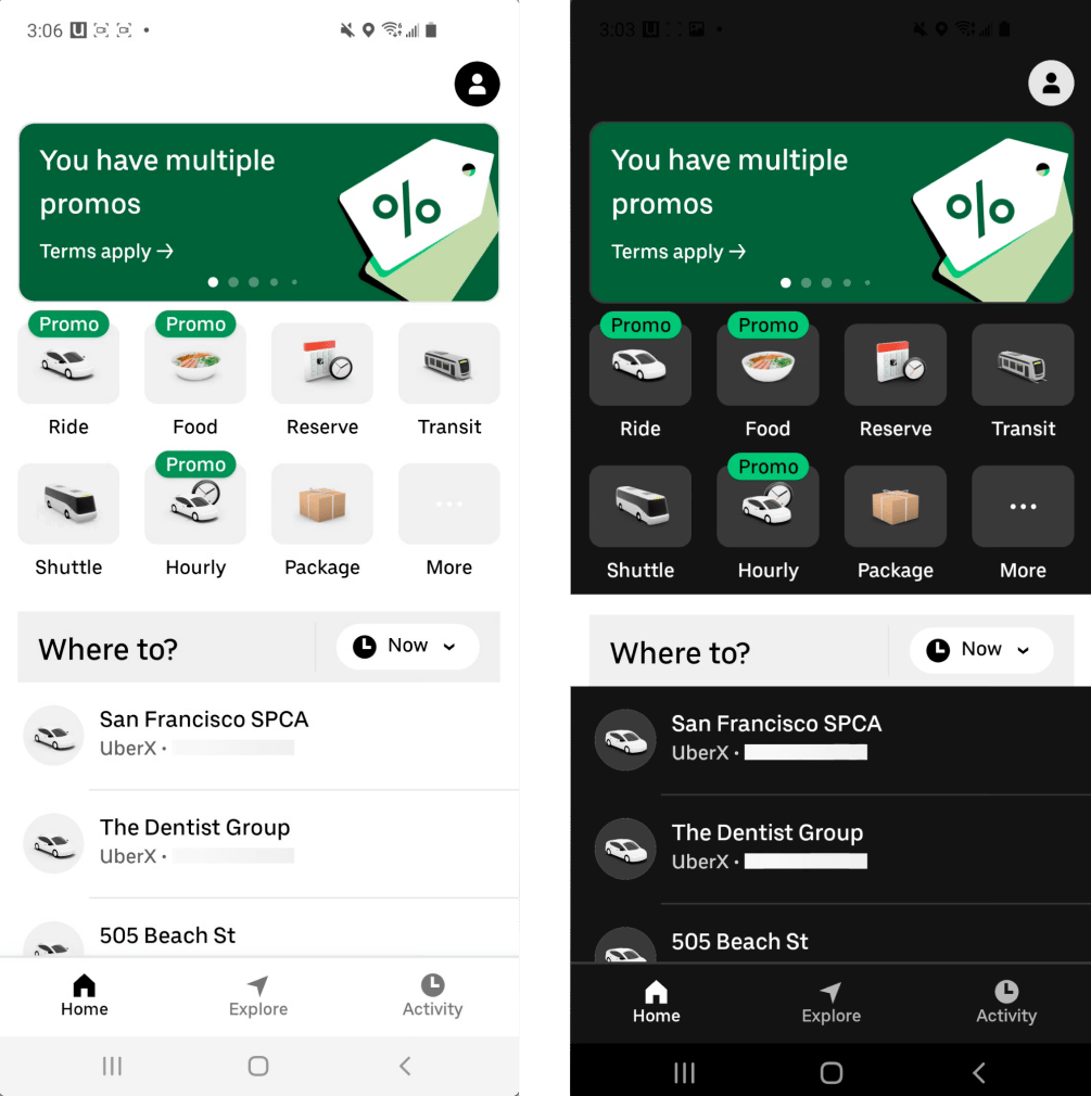
Internally we have a testing team that keeps track of our flows. We asked this team to test with dark mode enabled and create tickets for any bugs they find. While this was certainly not enough to fix all the dark mode bugs, it helped us to identify critical parts of our app that needed to adopt dark mode.
Some of these issues required review by a designer because, for example, an image color might blend with the background or the colors used were not part of any Platform Color. Designers would give their opinion about the right Base component and color to be used, or in some cases, they would even modify the image resources to make them work with dark mode.
Next, pull requests were handed to feature teams for approval, as they are the experts in the functionality of their features. Additionally, these approvals would help them to understand what new features need to have to support dark mode.
After identifying and fixing as many of the issues as we could find, we enabled dark mode support on Android for the whole company. This helped us to identify and fix even more unique scenarios we might have missed.
After a while of internal use amongst colleagues, the team was confident that it wouldn’t encounter significant bugs if we enabled the feature for production.
Once in production, we needed to maintain dark mode consistency across the app. As we discussed, we have tools that will educate engineers about UI Components and our testing team verify their flows in light and dark modes.
Beyond Dark Mode

Supporting dark mode, especially in a big app, is not an easy task. We needed to create tooling and themes around the idea of how to scale it for future features, while preventing the need to add code that would be hard to maintain. Code that is hard to maintain can spread like a virus; once code is in production, engineers might assume it is a good practice and implement it in new features. If we were to start from scratch, we would require, from the app’s inception, the usage of Platform Colors and reusable styling components accompanied with the tooling to quickly switch between light and dark themes earlier in the process.
Migrating to dark mode is not only about changing themes, but it is a sort of redesign. This exercise made us think about what would need to change to make rebranding easier and faster in the future.
In our case, dark mode was an opportunity to provide users with an accessible, safe, and consistent experience that allows more people with visual impairments and color deficiencies to use our platform. Additionally, the creation of new tooling will help prevent UI inconsistencies that engineers might easily overlook otherwise. In the end, it benefited our brand and most importantly, our users.

Humberto Castaneda
Humberto Castaneda is a Sr. Software Engineer on the Mobile Foundations team. He has been with Uber for 5 years, and currently focuses on UI components and Server Driven UI.
Posted by Humberto Castaneda
Related articles
How LedgerStore Supports Trillions of Indexes at Uber
4 April / Global
Most popular
Model Excellence Scores: A Framework for Enhancing the Quality of Machine Learning Systems at Scale
Scaling AI/ML Infrastructure at Uber

How LedgerStore Supports Trillions of Indexes at Uber

Migrating a Trillion Entries of Uber’s Ledger Data from DynamoDB to LedgerStore
Products
Company


