Engineering Uber’s Self-Driving Car Visualization Platform for the Web
August 28, 2017 / Global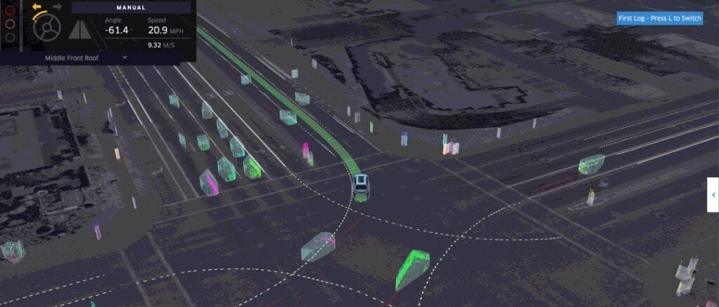
The ATG (Advanced Technologies Group) at Uber is shaping the future of driverless transportation. Earlier this year, the Data Visualization Team—which uses visualization for exploration, inspection, debugging and exposition of data—partnered with the ATG to improve how its self-driving vehicles (cars and trucks) interpret and perceive the world around them.
Using some of the latest web-based visualization technologies, the ATG Visualization team built a platform that enables engineers and operators across ATG to quickly inspect, debug, and explore information collected from offline and online testing. This is critical for ensuring that users of this technology understand issues quickly, iterate fast, and increase productivity across a wide range of ever-evolving use cases. There was also a need for a simpler visual language and UX design to convey all of the detailed, technical information to operators and engineers.
In this article, we describe how our Data Visualization team built this platform and explore the challenges of combining complex and diverse datasets into a reusable and performant web component.
Choosing the web
There are many interesting discussions around why the Web might be the right platform to build our self-driving car visualization platform. We turned to the Web for the following reasons:
- Fast cycle of iteration. On the Web, it is quick and easy to develop and deploy features incrementally. If a user wants the latest version of a product, they only need to refresh the browser’s page as opposed to downloading and installing a new app.
- Flexibility and shareability. Since the Web is hardware-agnostic, anyone, anywhere is able to work on the platform using any operating system—in fact, the browser becomes the operating system. Moving this system to the web bridged any team-wide OS divides and opened up the possibility of scaling the team beyond ATG headquarters in Pittsburgh. On the Web, reporting and diagnosing an incident is only one URL click away.
- Collaboration and customization. As a fast-evolving technology, self-driving vehicles never cease to produce new datasets, metrics, or use cases. New services and endpoints are added all the time. Each team at ATG has unique visualization and data generation needs. As such, they need to be able to customize their experiences. HTML5 and JavaScript are tested and trusted tools for creating custom UI on the fly, and are easily integrated into other infrastructure and task management systems.
Uniting diverse data sources
To understand the decisions made by an autonomous vehicle, a large amount of data is required to recreate the context around a trip. This includes maps that are preprocessed and vehicle logs that are generated at runtime.
Maps describe the connectivity and constraints of roads in a city. On top of what is available via Uber’s proprietary web-based map, maps for self-driving vehicles contain a lot more details. For example, high-resolution scans of the ground surface, lane boundaries and types, turn and speed limits, and crosswalks—basically any other relevant map information.

Vehicle logs describe what the vehicle is doing, what it sees, and how it acts. Three critical stages from algorithms are run based on sensor data: perception (measuring), prediction (forecasting), and motion planning (acting). In order to successfully operate, a vehicle needs to be able to perceive the activity around it through its sensors. Based on that information, it can predict where these objects will be in the near future, which will provide enough information to properly plan its next move (think: changing lanes or stopping at a stop sign).

Working with our self-driving engineers, we experimented and formalized a system of visual metaphors to represent complex data. The system offers realistic representation for environmental elements such as cars, ground imagery, lane markers, and signs which enable operators and engineers to anchor their understanding of the vehicle’s surroundings.
To help engineers peek into alternative decisions or time slices from the future, the system also offers abstract representation for algorithmically generated information such as object classification, prediction, planning, and lookaheads by way of color and geometric coding.
One of the biggest challenges of bringing these data sources together into one unified view is dealing with disparate geospatial coordinates. Different services offer models for using different coordinate systems: some in latitude/longitude, some in the Universal Transverse Mercator coordinate system (UTM), some relative to an absolute world position, and others yet relative to the position and orientation of the vehicle. Furthermore, all the positions are updated at high frequency during playback by being sampled multiple times a second. To convert these coordinates efficiently and project them accurately, we delegated the heavy-lifting to our GPU.
Rendering performant 3D scenes with WebGL
Uber’s Visualization Team maintains a suite of frameworks for web-based large scale data visualization, including react-map-gl and deck.gl. These frameworks leverage the GPU capacities in the browser to display millions of geometries at a high frame rate. If visualization is interpreted as mapping from the “bit” (data structure) to the “pixel” (graphics)—essentially applying the same transformation on millions of inputs—the GPU is naturally the ideal venue, as it is designed to perform the same task repeatedly in parallel.

Ultimately, performance is the deterministic success factor for this collaboration. ATG engineers and vehicle operators need the vehicle logs to play in real time and smoothly manipulate the camera and select objects in a scene. This is where our advanced deck.gl data visualization framework comes into play.
The latest release of deck.gl features numerous performance optimizations and graphic features that are driven by use cases originating from our work with ATG. Each layer in the deck.gl context renders a data source into a given look, either mesh (ground surfaces and cars), paths (lanes and trajectories), extruded polygons (other objects on the road), or point clouds (3D objects without current semantic meaning). Each layer can also specify their own coordinate system, while sharing the same camera view. A typical log snippet renders 60-100 layers at 30-50 frames per second.


Next steps
Given the rapid pace of ATG’s development, having the right products for Uber’s self-driving engineers is key for our growth. We are excited to architect the future of transportation with driverless vehicles; are you onboard?
If mapping self-driving technologies interests you, consider applying for a role on Uber’s Data Visualization Team.
Xiaoji Chen is a software engineer on the Uber Data Visualization team.

Xiaoji Chen
Xiaoji Chen is a senior software engineer on Uber's Data Visualization team.
Posted by Xiaoji Chen
Related articles


Most popular
From Archival to Access: Config-Driven Data Pipelines

Unlocking Financial Insights with Finch: Uber’s Conversational AI Data Agent
Migrating Uber’s Compute Platform to Kubernetes: A Technical Journey