We previously highlighted some of the presentations delivered during our second annual Uber Technology Day. In this article, engineering senior software engineer and Uber Tech Day presenter Ines Viskic discusses how we ensure the accuracy of our maps through quality metrics.
On the surface, Uber’s ridesharing technology may seem simple: a user requests a ride from the app, and a driver arrives to take them to their destination. Behind the scenes, however, a giant infrastructure consisting of thousands of services and terabytes of data supports each and every trip on the platform.
At the heart of this infrastructure, both map data and services enable the most basic features powering our business. These features include the ability to find locations and addresses, match riders with drivers by geographic proximity, show drivers and riders their estimated time of arrival (ETA), and navigate them to their destinations. Although map data and services initially grew to support ridesharing, we continue to build new products on this base, such as Uber Eats, Uber Freight, and JUMP Bikes.
Rather than the simple, two-dimensional representations people see when they look at the Uber app, a map is actually a complex data structure. In computational terms, we need to define the size of each geographical portion of a map, as well as decide which objects are included/displayed on a map. For our purposes, roads and crossroads, as well as their attributes, are the most obvious inclusions. On the other hand, features such as contour lines connecting points of equal elevation are irrelevant to our current use cases, so we do not include them on our maps.
As the world around us changes, so should maps. For instance, a new restriction on left turns at an intersection will change the routes we send to drivers; the addition of a stop sign or a temporary road closure due to construction will affect the ETA times we compute; and a challenge unique to ridesharing services involves determining allowable pick-up and drop-off places on the map.
At Uber, the quality of our map data and map services is invaluable to delivering a great user experience. To accomplish this, maps must reflect geographic reality as closely as possible. The geospatial data generated by each of the millions of trips taken daily makes this possible, helping us refine and update our maps to achieve the highest quality. In this article, we define our map regions and show how we compute map quality metrics.
How Uber defines a map region
Before we can compute and report map quality metrics, we first need to define our map regions. For example, we might be interested in the map quality of North America, or the state of California, or Santa Clara County, or even just the most urban (and trafficked) areas of the city of San Francisco.
Before Uber launches operations in a new area, we define and onboard a new region to our map technology stack. Inside this map region, we define subregions labeled with grades A, B, AB, and C, as follows:
Grade A: A subregion of Uber Territory covering urban centers and commute areas that make up approximately 90 percent of all expected Uber traffic. With that in mind, it is of critical importance to ensure the highest map quality of grade A map regions.
Grade B: A subregion of Uber Territory covering rural and suburban areas that might be less populated or less traveled by Uber customers.
Grade AB: A union of grade A and B subregions.
Grade C: A set of highway corridors connecting various Uber Territories.
The Uber Map Model
Maps are intuitively defined by their purpose. A map orients us in space, letting us see where we are in the world. With a map, we can also navigate from where we are to where we want to go.

From the perspective of determining map quality, we define a map as a collection of map features, from man-made places like road segments, junctions, and buildings to natural features such as mountains, lakes, and oceans. Further, for Uber-specific use cases, we include access points, which specify allowed or preferred pick-up and drop-off locations for a certain address point, as map features. For example, access points at the San Francisco International Airport include a set of terminals, gates, and airport-determined gathering spots.
Finally, each map feature has a set of attributes that fully describe it. For example, a road segment’s attributes include geometry, length, name, road class (local road? highway?), and usage (road? bike path?).
Map features and attributes form a data structure which we call the Uber Map Model (UMM). We can visualize the UMM as layers of map features that collectively create a map, as seen in Figure 1, on the right.
�
Determining map quality
Map quality means different things to different map users. For example, imaging tools such as Google Earth and Esri’s ArcGIS Earth might focus on the accuracy of map labels or the aesthetics of map cartography, i.e., how each map tiles looks. For Uber’s most basic use case, ridesharing, map quality metrics must answer questions such as:
- Do we have enough roads? Are we classifying them correctly?
- Are we picking up and dropping off our riders at the right locations?
- Are we navigating drivers on optimal routes?
- Do we have the addresses and locations that people are taking trips to?
- Are our road names accurate, and do they reflect local usage?
The full set of metrics we use in our maps are too numerous to list, but we can divide them into simple and comparative coverage metrics. Simple metrics include roads, unique route counts, signpost counts, turn restrictions, and number of lanes per road. We compute these metrics by simply analyzing map data as a single input. A more complex set of metrics we take into account, comparative coverage, uses two inputs: map data being processed for quality and reference map data.
Both simple and comparative metrics are computed automatically by using powerful data processing frameworks. However, some metrics are more difficult or even impossible to automate: are the pitch and timing of voice prompts for navigation correct and user-friendly? Are the map tiles displayed in an aesthetically pleasing manner? Are the street labels clear and readable? To get such answers/metrics, we conduct map quality evaluation drives, for which we create evaluation surveys in the form of multiple choice questions. The results of these surveys are then processed and aggregated into metrics.
Regardless of their categorization, all metrics computation must be accurate, execute reasonably fast, reliably generate output, and scale with no issues. Scaling is especially important, as a fatal error of a certain region’s metrics computation must not affect metrics computation in other regions.
Requirements of Uber’s map quality computation system:
|
Ensuring map quality
Uber uses map data from a variety of third-party map providers, with a goal to enable a great Uber experience to our users. To ensure high quality or these maps, we utilize an iterative process of analyzing map data, identifying map defects, and fixing them. This creates a positive feedback loop for improving the maps. Here are some examples of that:
- Trace coverage: A comparative coverage metric, trace coverage identifies missing road segments or incorrect road geometry. The computation uses two inputs: map data under testing and historic GPS traces of all Uber rides taken over a certain period of time. We overlay those GPS traces onto the map, comparing and matching them with road segments. If we find GPS traces where no road is shown, we can infer that our map is missing a road segment and take steps to fix the deficiency.

- Routing evaluation: Another critical metric of map quality, evaluating routes lets us identify incorrect turn restrictions and road directionality on our maps. Here, we compare the routes our navigation algorithm suggests for drivers with the actual routes they choose to take. If there is a sustained discrepancy between the suggested and actual routes, we investigate for potential map defects. Figure 3, below, shows an example of a large discrepancy between the suggested and actual routes. Our consequent comparison revealed incorrectly modeled turn restrictions on road segments that made it impossible to use the suggested route.

- Preferred access (pick-up) point accuracy: Pick-up points are an extremely important metric to the rider experience, especially at large venues such as airports and stadiums. For this metric, we compute the distance of an address or place’s location, as shown by the map pin in Figure 4, below, from all actual pick-up and drop-off points used by drivers. We then set the closest actual location to be the preferred access point for the said location pin. When a rider requests the location indicated by the map pin, the map guides the driver to the preferred access point. We continually compute this metric with the latest actual pick-up and drop-off locations to ensure freshness and accuracy of the suggested preferred access points.

Computing quality map metrics
Uber’s metrics computation system generates metrics (such as those described above) from map data, i.e., a set of map features described in UMM format. Each map data set and the metrics derived from them are associated with a specific map region.
The first step in metrics computation involves partitioning map data onto S2 cells by assigning each map feature in that set an S2 cell ID. S2 cells are geographical areas, each represented by a unique numerical identifier. So, for example, map features such as road segments, buildings, and mountains would each be assigned the ID of the S2 cell representing the geographical area where they are found.
Next, we input map data partitioned onto S2 cells into our metrics computation system, which processes each S2 cell partition independently (in parallel) to generate our metrics. In other words, an S2 cell with its associated map features becomes a basic unit of metrics computation. Finally, we aggregate the metrics from each S2 cell in a specific region. As noted above, those regions are graded A, B, AB, and C depending on their contents and use. This approach is outlined in Figure 5, below:

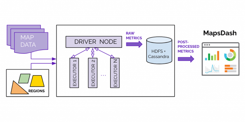
We implemented our metrics computation system in Apache Spark, a general computation framework for large-scale data processing, with a single driver node and multiple executor nodes that read inputs and store outputs to a distributed storage system.

Our metrics computation system, shown in Figure 6, above, uses two inputs: map data and regions. The driver node directs the control flow and distributes map data to executor nodes, first to partition the data onto S2 cells, then to compute metrics for each S2 cell unit. The raw S2 cell-based metrics will be sent back to the driver node, which aggregates them into region metrics and stores them in HDFS, our distributed file system, and later, in Cassandra, our distributed database. The metrics are then post-processed for display and analysis in MapsDash, an internally developed central dashboard for viewing metrics that provides intuitive, valuable insights into map quality.
Putting it all together
Figure 7, below, shows the entire map quality system, consisting of (1) the metrics computation system, (2) metrics display, and (3) root-cause analysis tools. This system creates a positive feedback loop aimed at improving map quality by ensuring the accuracy of our metrics.

We continuously iterate our map quality measurements, displaying them to detect low-grade metrics and identifying the map defects causing them. Over time, this system has led to improved map quality metrics, leading to better maps across our markets in San Francisco, New York, and other cities around the world.
Next steps
Uber is continuously growing its business, both in scale and in the number and quality of features we provide for our users. Similarly, our map quality team continuously develops new map quality metrics and tools for diagnosing and fixing map defects. In the future, we intend to continue working closely area with our data science teams to identify new metrics that are relevant indicators of data quality in routing and navigation. Additionally, we plan to develop new diagnostic tools to determine the root cause of map defects behind these metrics. Identifying missing roads and incorrect turn restrictions are especially relevant to achieving optimal map quality. Along with these efforts, we are continuously improving our map editing tools to fix such defects. Over time, these updates will lead to better maps, thereby optimizing the trip experiences for users across the globe.
Learn more about our mapping data providers.
If you are interested in contributing to map quality metrics and building innovative, map-based applications, consider applying for a role on our team.
Subscribe to our newsletter to keep up with the latest innovations from Uber Engineering.

Ines Viskic
Ines Viskic is a senior software developer on the Maps team at Uber and has, along with her colleagues on Uber’s MapQuality team, developed the metrics computation framework outlined in this article. She holds a PhD in Computer Engineering from University of California, Irvine.
Posted by Ines Viskic