
How did the pedestrian cross the road?
Contrary to popular belief, sometimes the answer isn’t as simple as “to get to the other side.” To bring safe, reliable self-driving vehicles (SDVs) to the streets at Uber Advanced Technologies Group (ATG), our machine learning teams must fully master this scenario by predicting a number of possible real world outcomes related to a pedestrian’s decision to cross the road. To understand how this scenario might play out, we need to measure a multitude of possible scenario variations from real pedestrian behavior. These measurements power performance improvement flywheels for:
-
- Perception and Prediction: machine-learned models with comprehensive, diverse, and continuously curated training examples (improved precision/recall, decreased training time, decreased compute).
- Motion Planning: capability development with scenario-based requirements (higher test pass-rate, lower intervention rate).
- Labeling: targeted labeling jobs with comprehensive, diverse, and continually updated scenarios (improved label quality, accelerated label production speed, lowered production cost).
- Virtual Simulation: tests aligned with real-world scenarios (higher test quality, more efficient test runs, lowered compute cost).
- Safety and Systems Engineering: statistically significant specifications and capability requirements aligned with the real-world (improved development quality, accelerated development speed, lowered development cost).
With the goal of measuring a scenario in the real world, let’s head to the streets to study how pedestrians cross them.
Driving to observe pedestrians
To understand the various ways a pedestrian might cross the street, we start by driving a SDV in a real neighborhood to observe pedestrian behavior. With a driver behind the wheel and the SDV’s perception system activated, the onboard computer detects, tracks, and records the movement of the pedestrians it sees.
For this example analysis, let’s take a sample of 312 miles of SDV driving over the course of 26 non-consecutive hours around a 1.7 square mile neighborhood, as depicted in Figure 1, below:
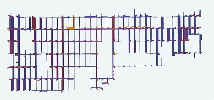
The bar height in Figure 1, above, indicates the number of times the SDV drove on a specific lane. The “spikes” at intersections result from the SDV crossing the same intersection multiple times as part of a “grid-coverage” driving pattern.
An ideal driving sample would contain an equal number of miles driven on every street, at every hour, day, week, and month, under the same weather conditions. The down-selected sample of data used in this analysis consists of 312 miles over 26 hours of SDV driving so it’s worth highlighting the resulting selection bias. For example, the driving does not cover all streets equally (Figure 1) and it occurs mostly on weekdays between 9am and 3pm (Figure 2). This informs us that resulting measurements about pedestrian behavior will skew toward describing these streets and times of day.

Data mining the scenario “pedestrian crossing the street”

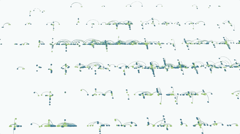
While the SDV perception system is designed to detect pedestrians, only a subset of pedestrians actually cross the street. To identify just that scenario, we data mine every pedestrian detection for the ones that actually cross the street, similar to how one might mine a mountain for diamonds. This is done according to a two-part scenario definition: a pedestrian enters a driving lane (starts crossing the street), and then exits onto a different side of the street (finishes crossing the street). In this example, among the 312 miles of driving, the data mining operation surfaced 2,404 observations of pedestrians crossing the street, as depicted in Figure 4, below, which visualizes the “start” and “end” of these observations on a map:
With thousands of examples of pedestrians crossing the street at our analytical fingertips, let’s take a closer look at the data mined measurements to better understand how they get to the other side of the road.
Analyzing the “pedestrian crossing the street” scenario
The scenario of a pedestrian crossing the street has many relevant measurements, including the pedestrian crossing speed, road width, distance walked, crossing duration, distance walked on crosswalk, and traffic light state(s) at the time of crossing. Like observing a sprinter at the track, these measurements describe how the scenario occurred (e.g., the sprinter ran 100m in 14 seconds). Let’s start by analyzing just one measurement: the pedestrian crossing speed.
The fastest and slowest pedestrians

Figure 5, above, depicts a scatter plot of average crossing speeds from a sample of 2,404 observations, with the fastest and slowest pedestrians visualized on the right. The overall average crossing speed average is 1.39 m/s ± 0.019 (or 3.11 mph ± 0.042) with 99 percent confidence, which aligns with findings from studies by the US Department of Transportation. The fastest crossing speed is 3.6 m/s (equivalent to running a mile in 7 minutes, 28 seconds). The box plot (to the right of the dots in Figure 5) indicates that a majority of the observations are clustered near the mean.
Let’s investigate these values closer in the following distribution:
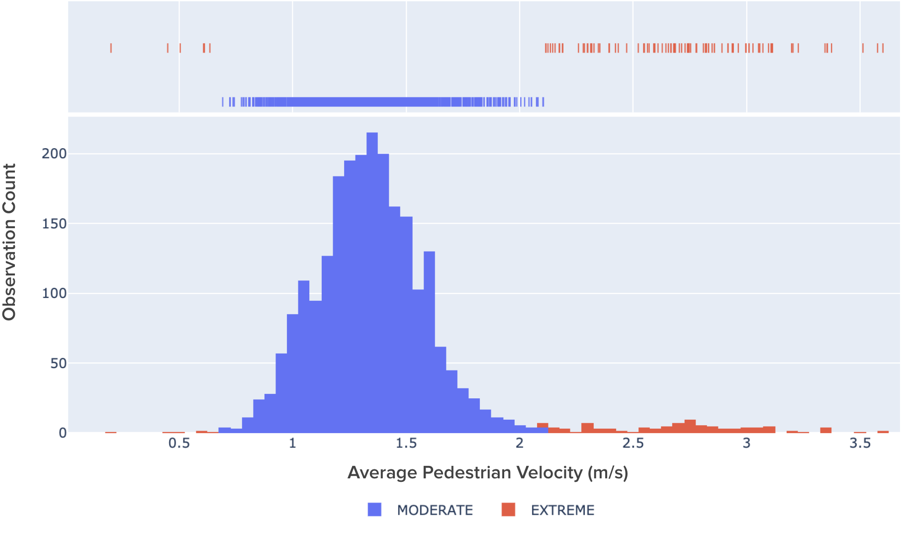
The distribution in Figure 6, above, confirms that a majority of the observations are clustered near the mean, revealing an overall bell curve shape. The blue and red coloring differentiates values as either within or outside of two standard deviations from the mean. Blue is “moderate” and inside two standard deviations whereas red is “extreme” and outside of two standard deviations.
The red bars reveal the presence of a slight bi-modal distribution (i.e., there are actually “two” bell curves). While the blue values capture people walking across the street (“moderate” values), the red “extreme” values capture people jogging across the street (centered around 2.7 m/s, which is about a 10-minute mile pace).
Now, let’s further investigate the shape of this scenario by adding a second measurement, entering a two-dimensional scenario “space.”

In Figure 7, above, we share a two-dimensional scatter-plot of the same 2,404 observations, but now, with a second measurement. In this graph, the average speed measurement (x-axis) is plotted against the distance the pedestrian travelled while crossing (y-axis).
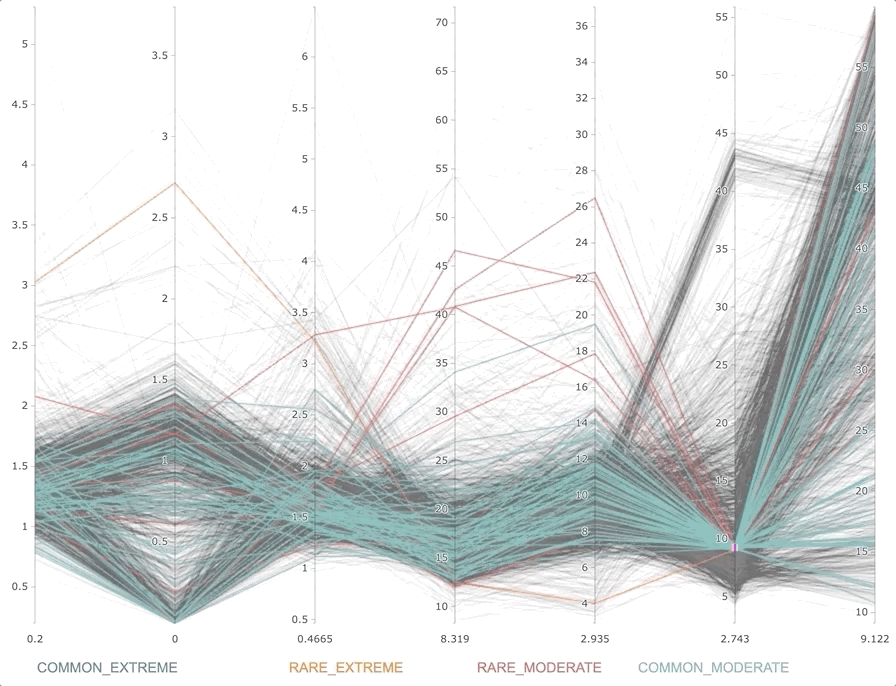
This plot also features a second classifier that identifies frequently (“common”) or infrequently (“rare”) occurring values. With both classifiers applied (including the previous magnitude classifier), the blue dots represent the typical way pedestrians cross the street (“common and moderate” values), the yellow dots represent atypical, but not in obvious ways, crossings (the “rare and moderate” values), and the pink dots represent noticeably uncommon ways to cross the street that are “rare and extreme” (like sprinting or walking slowly across a large intersection). Findings here include that there is a large cluster of pedestrians traveling ~18 meters to cross the street at a velocity of ~1.4 m/s.
Let’s up the ante and add a third measurement, entering a three-dimensional scenario: “space.”
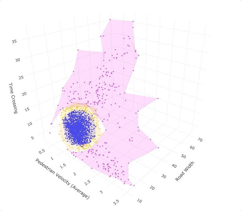
The visualization above consists of the same 2,404 observations as before, but this time, with the addition of a third measurement: the time the pedestrian spent crossing the street. The added 3D perspective supports intuitions not necessarily reflected in our previous analyses such as the idea that slower walking speeds across longer distances often takes more time. It also makes scenario spaces, like the pink “rare and extreme” space, more visually tangible. The visualization in Figure 9, below, highlights the bulk of values in the blue variation space of “common and moderate” crossings:

There are, however, additional measurements we can take that further define the “crossing the street” scenario and provide even richer insights. What is it like analyzing scenarios in four dimensions and beyond?
Scenarios can incorporate many more than three measurements. Figure, 10, above, visualizes a seven dimensional “scenario space” consisting of the same 2,404 observations of pedestrians crossing the street, but this time, with four additional measurements including maximum pedestrian speed, minimum pedestrian speed, closest pedestrian distance to SDV, and furthest distance to SDV added to the previous 3D visualization. The shape of a “N” dimensional scenario space informs the SDV development workflow at almost every stage including selecting the right data for labeling and machine learning, developing simulations that mirror the real-world, and creating data-driven safety requirements.
How many observations of a scenario are enough?
How many times do you need to see people cross the street before you really know how they do it? To approach this question, we employ confidence intervals and margin of error statistics. The three charts in Figure 11, below, illustrate these statistics applied to the average pedestrian crossing speed measurement.

The first chart shows the raw plot of all 2,404 observations of average pedestrian speeds in the order they were collected.
The second plot in Figure 11 shows the cumulative mean of these speeds within a 95 percent confidence interval (the pink dashed lines). Notice that the confidence intervals “tighten” around the mean with additional observations.
As the confidence interval converges, the margin of error for the estimate decreases, as visualized in the third plot. By the 2,404th observation, the estimate of the average crossing speed is 1.39 m/s ± 0.014 with 95 percent confidence.
Given the confidence interval and margin of error statistics, how do we know how many observations are enough? It depends on what’s being measured and the required level of error. Interestingly, at about 1,000 cumulative observations of average pedestrian crossing speeds, the margin of error approached its lowest level at just over 0.02 m/s. If this margin of error were acceptable, then the next 1,404 observations weren’t strictly necessary to arrive at the answer.
This number isn’t perfect though. For example, these measurements are based on a sample of 312 miles of driving in one neighborhood that was collected with geographic and temporal selection bias (i.e., the neighborhood wasn’t observed at all times and places evenly). For example, there were no observations of night or weekend crossings. Additionally, the “rare” crossings are particularly important to understand, but can be especially difficult to capture (because they’re… rare). But the margin of error for “rare” values can be calculated too, informing the necessary number of observations to collect to establish statistical significance for them as well.
A data mining-powered autonomy organization
Data mining and analytics accelerate development across an autonomy organization, in our case, SDVs. From providing machine learned models with systematic and diverse training examples to powering statistically significant measurements for safety case and system engineering development, data mined scenarios are a strategic data asset that give researchers the information necessary to simulate real world scenarios with confidence.
Applications for data mining in SDV development stretch beyond scenario measurement as well. For example, it’s used for collecting observations of stop signs (non-moving infrastructure) as well as for collecting observations of any moving actor (such as people on scooters). It’s also used to mine novel data among fleets of networked vehicles. Imagine sourcing only unique examples of pedestrians crossing the street from millions of vehicles until there are enough observations to power statistical significance for every measure in all places and times (including rare and extreme types). Like prospectors sifting gold from sand, data mining sifts data “gold” for SDV development, facilitating safe, reliable self-driving transportation to power the future of mobility.
Learn more about Uber ATG’s engineering and data science work:

Steffon Davis
Steffon Davis is a product manager with Uber's Advanced Technologies Group, working on the development of self-driving vehicles.

Shouheng Yi
Shouheng Yi is a senior software engineer at Uber ATG.

Andy Li
Andy Li is a software engineer on the Data Engineering team at Uber ATG. In his free time, he enjoys making squash brownies.

Mallika Chawda
Mallika Chawda is a software engineer on the Data Engineering team at Uber ATG.
Related articles


Most popular

Building Scalable, Real-Time Chat to Improve Customer Experience
How Uber works with the Police to report crime

Uber for Business | 2024 UK Business travel trends outlook

Your guide to monitor your Order Accuracy on Uber Eats
Products
Company
